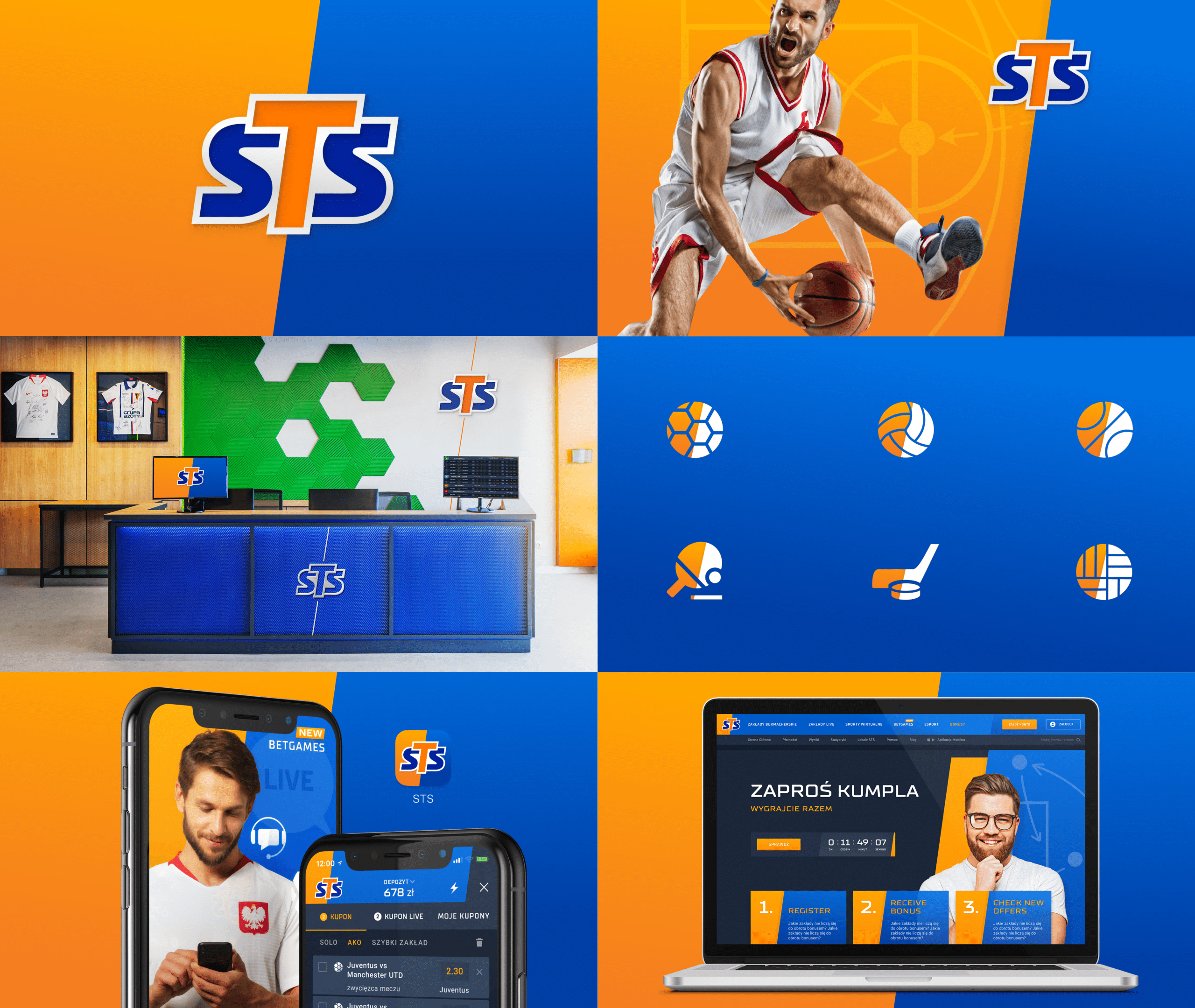
Dragon Rouge has prepared a new visual identity for betting company STS
STS's new visual language
A completely new visual language, built on a revised brand communication strategy – this is the result of a collaboration between strategic branding agency Dragon Rouge and the market leader in sports betting in Poland, which also operates in over a dozen European markets. The change covers all STS platforms in Poland and Europe, including websites, mobile apps and its own social media channels.
Leader of the Polish betting market
STS is the largest betting company in Poland, and it also operates internationally. The company runs operations in European markets, with services available in the United Kingdom, Germany, Iceland, Luxembourg, Slovenia, Andorra, San Marino, as well as Gibraltar, Slovakia, Malta and Latvia. Thanks to dynamic growth in recent years, STS has come to dominate the sector of legal betting companies in Poland – significantly increasing its market share, which now stands at more than 47%. Currently, around 80% of revenue is generated through online channels.
Evolution of the logo and graphic system
The work was preceded by an analysis of trends in building visual identity in the industry in Poland and worldwide. The brand identity presented corresponds to the new communication strategy and reflects its dynamic development. The mark was given a lift, simplified and modernised. The logo symbolises the brand's energy and sporting character. A visual language was introduced based on the distinctive device of combining colours in a diagonal division. At their intersection sits the mark itself, which reinforces the visibility of the branding. The heroes of this system are players, sports fans who know the brand inside out. The assets used in digital, social media and outdoor were designed and unified. STS outlets were also given a lift. The system covered all aspects of the marketing communication used by the client.
"The new take on the visual identity is a carefully considered evolution of the graphic elements thanks to which the brand is already very recognisable today. The guiding theme for the changes was simplification and giving greater momentum to STS's visual identity. In this spirit, the graphic mark, the colour palette and the brand's typography were all changed. As a result, the brand has become more modern and even more self-assured – as befits a market leader." says Arkadiusz Łoś, Brand Consulting & CI Director at Dragon Rouge
Rollout of the changes from November 2019
The project was carried out in collaboration with many STS departments. The creative work, based on the new communication strategy, was handled by a multidisciplinary team at Dragon Rouge. The changes are being rolled out gradually from November 2019.